
Hero Section
I wanted the opening to feel less like an informational website and more like arriving at the lake. I filmed the background footage myself and layered animated typography over it with Lottie, creating an atmospheric introduction before the site moves into facts, stories, and more playful interactions.
Lake Comparison Scroll
Lake Michigan feels almost oceanic when you stand beside it, but its scale is difficult to understand from the shoreline alone. This scroll interaction places it alongside some of the world’s largest lakes, using movement and changing proportions to turn a geographic comparison into something you can experience visually.
Name Breakdown Animation
The name “Michigan” comes from the Ojibwe word mishigami, referring to a great or large body of water. I turned that piece of history into a small animated typographic moment, giving the origin of the lake’s name its own pause within the larger story.
Lakefront Population
Around 12 million people live along Lake Michigan’s shores, so the lake is also the backdrop to a huge amount of everyday life. I used animated portraits and a simple statistical moment to shift the story from the physical scale of the lake to the communities that surround it.
Singing Sands & Beach Conditions
Some of my favorite discoveries while researching the project were the smaller details that make the lake feel more surprising, including beaches where the sand can produce a faint sound under the right conditions. This section mixes typography, masked imagery, and horizontal movement to tell those smaller natural stories while keeping the pace of the page changing as you move through it.
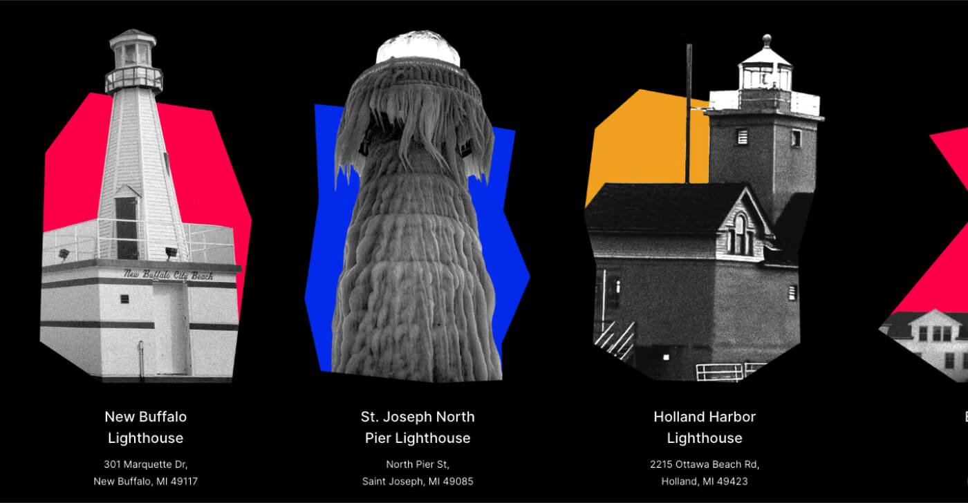
Lighthouse Carousel
Lighthouses are scattered around Lake Michigan and carry a lot of the visual history of the shoreline. I built a horizontal journey through several of them, combining photography and location information so the section feels closer to traveling around the lake than browsing a list of landmarks.
Fish Parallax
The lake has its own underwater population, and I wanted that part of the story to feel especially playful. Native fish move through the page at different speeds as you scroll, creating a loose sense of depth and turning a simple species guide into a small underwater scene.
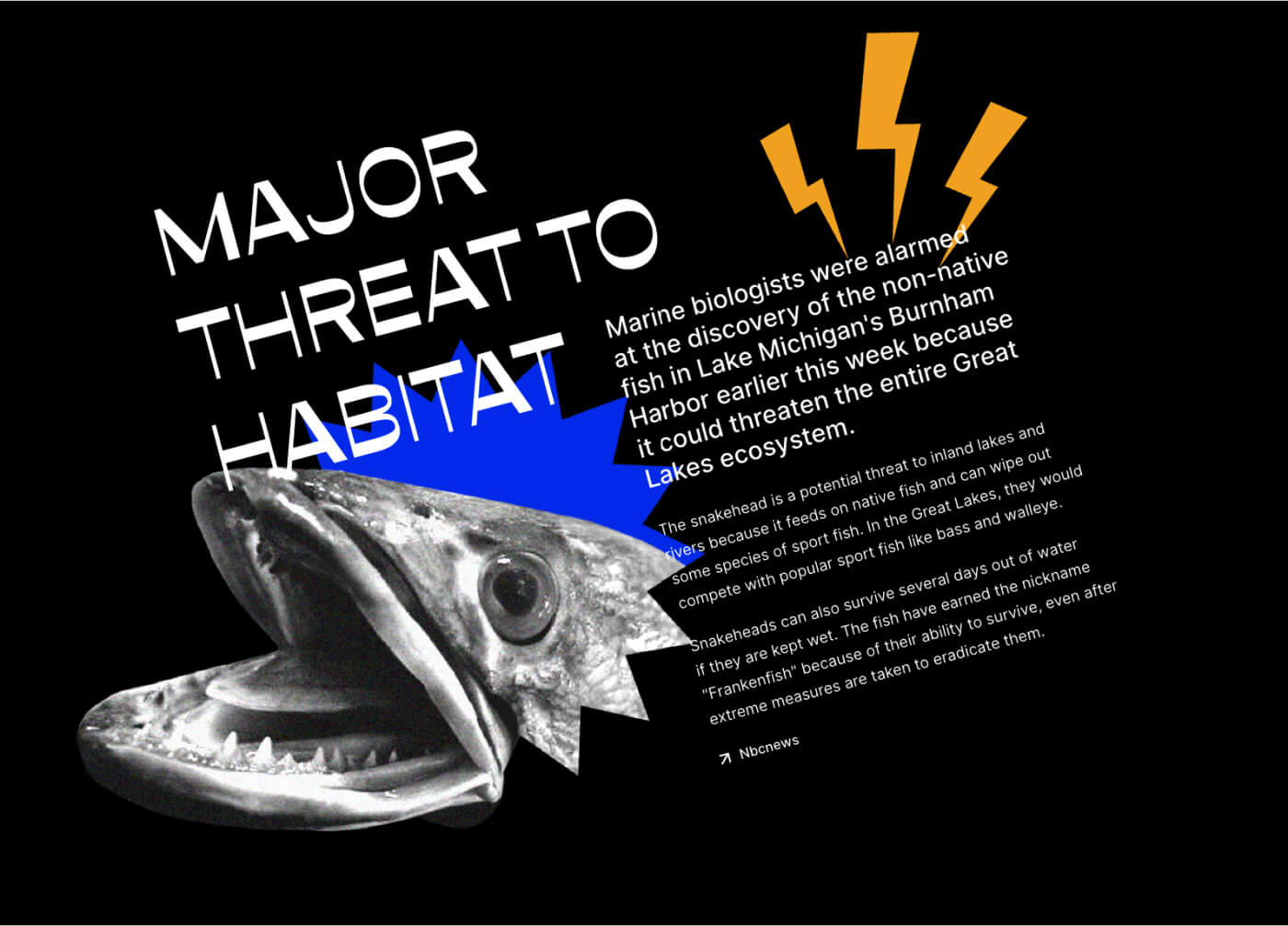
Environmental Threat Block
The final part of the story looks at some of the pressures affecting the lake, including invasive species and broader ecological change. I shifted the visual language here toward denser typography and more unsettling imagery, including the “Frankenfish” treatment, to give the environmental material more urgency while keeping it connected to the personality of the rest of the site.