
Hero Animation
Because the project was so personal, I wanted the first interaction to feel like entering my own little world rather than opening a portfolio. Animated typography, illustration, and motion set the tone immediately and gave the gallery a playful sense of movement before any of the artwork appeared.
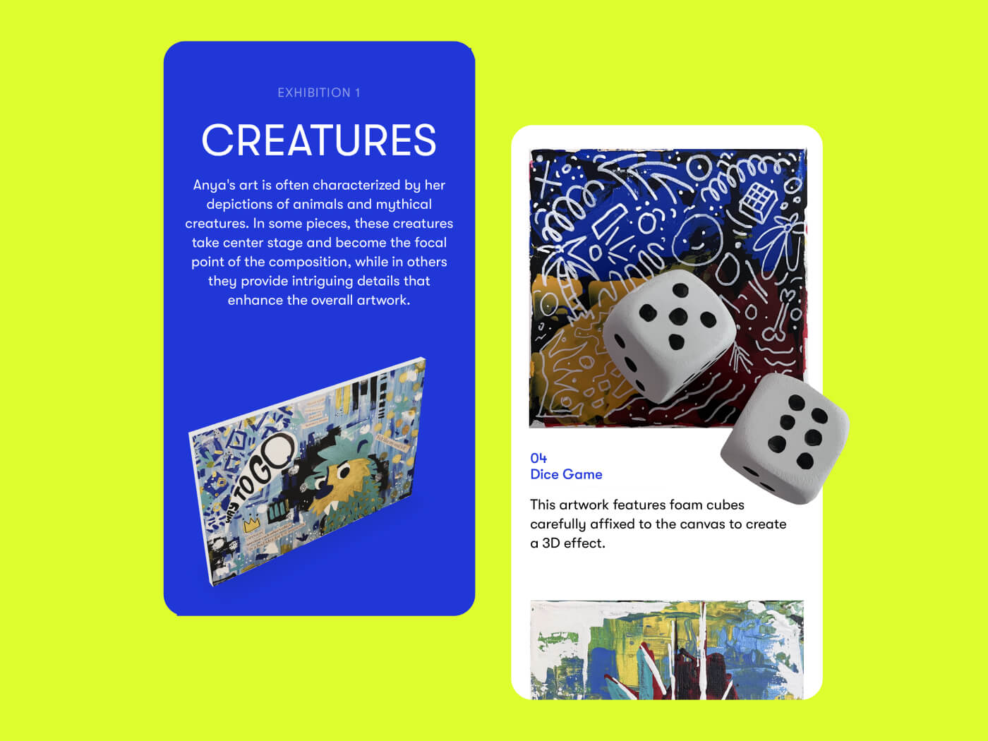
Exhibition: Creatures
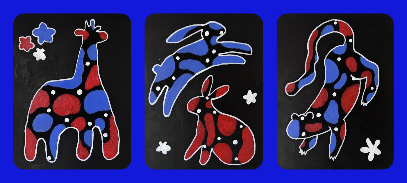
A lot of my earliest paintings revolved around animals, strange characters, and imaginary creatures, so they naturally became the first exhibition. I treated the page more like a loose museum wall than a standard image gallery. Paintings move through the space at different scales, while scroll interactions and small moments of animation give each piece its own presence. Some of the original works also included physical materials like foam dice and layered textures. I used 3D techniques to preserve some of that dimensional quality on-screen, including on mobile.
Virtual Sculpture Gallery
As I kept experimenting with painting, I also became interested in how the website itself could become part of the artwork. This rotating 3D structure turns a group of paintings into a virtual installation. Visitors can move around it and discover different pieces across its surfaces, making the experience feel closer to exploring an object than browsing a gallery page.
Painting Spotlight: The Festive Gray
Some of the paintings became more personal as the practice developed. The Festive Gray came from memories of growing up in Chelyabinsk, Russia, where long gray winters and Soviet apartment blocks were part of the everyday landscape. I embedded real string lights into the original painting, then placed the work against an apartment building in the digital version to reconnect it with the environment that inspired it.
About the Artist
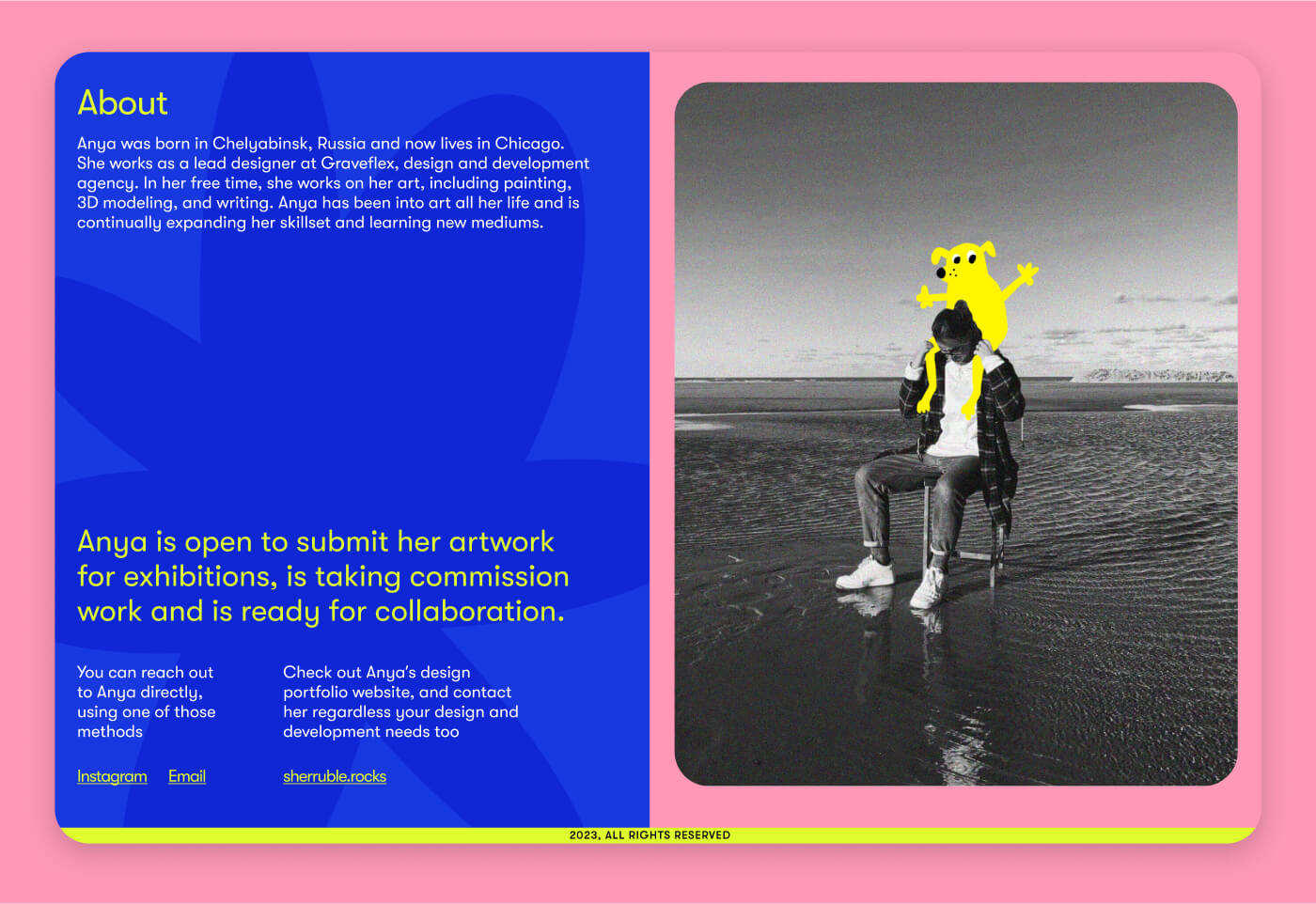
At the time, I was still figuring out what it meant for me to call myself an artist at all, so I wanted the final section to feel personal, not so formal. It became a small introduction to where the work was coming from, what I was exploring, and an invitation to connect around commissions, exhibitions, or future creative projects.