Building a More Flexible Brand
As Continua grew into a unified company, the brand needed more range, more personality, and clearer rules for how it should show up across different touchpoints. I refreshed the visual system with a broader color palette, a more expressive type system, and a set of graphic devices that made the identity feel friendlier, more modern, and easier to adapt.
The work extended beyond the visual refresh itself. I developed comprehensive brand guidelines, created practical usage rules, and built a digital brand hub so the system could be used consistently across the organization.
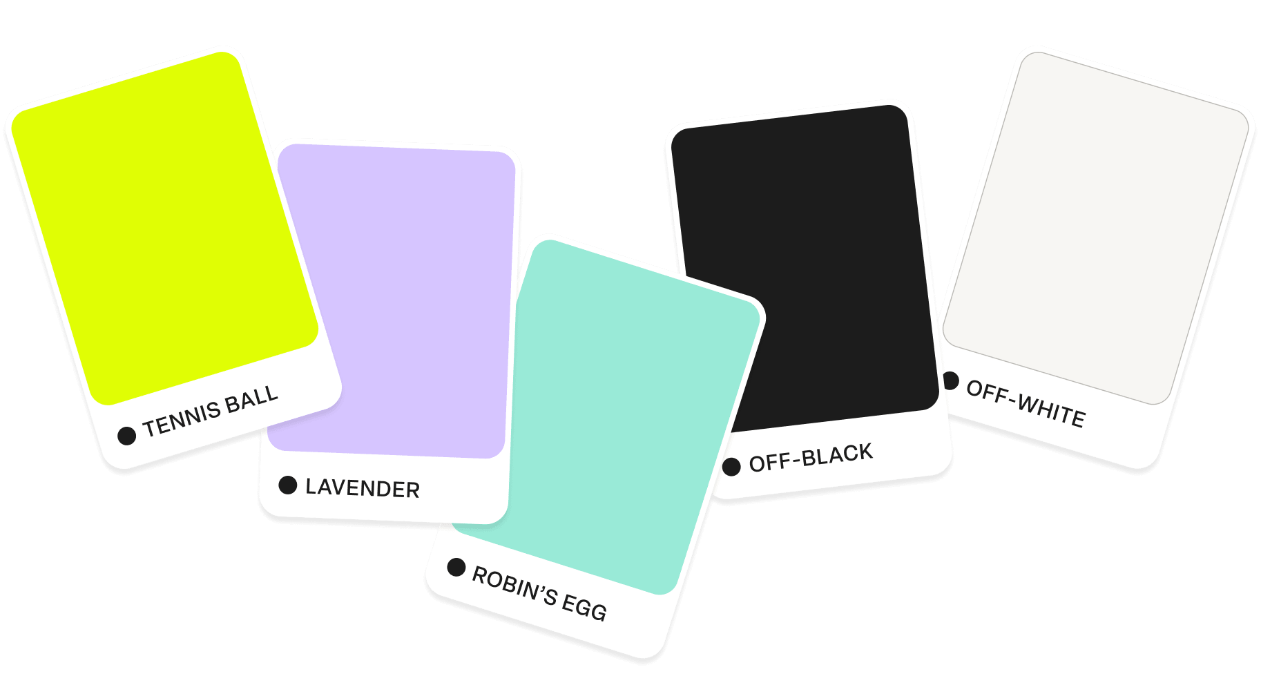
Color: A Broader, More Flexible Palette
The existing tennis-ball yellow stayed at the center of the identity, while lavender and robin’s-egg teal added more range. I also developed lighter and darker shades for each accent, giving the system more flexibility across layouts, illustration, and digital use.
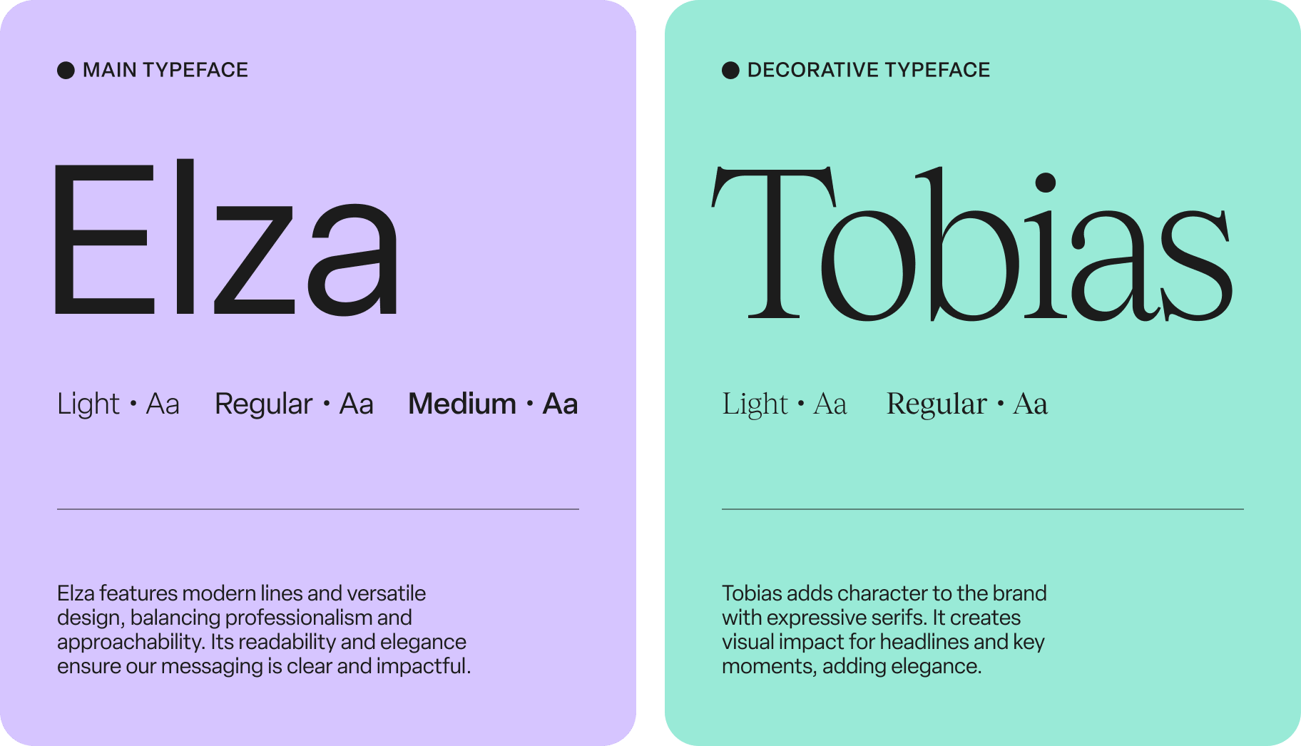
Typography: More Personality in the Type System
I introduced Tobias as an expressive display typeface to complement Elza, the primary sans serif. The combination gave the brand more character while keeping everyday communication clear and practical. I also defined rules for hierarchy, pairing, alignment, and weight.
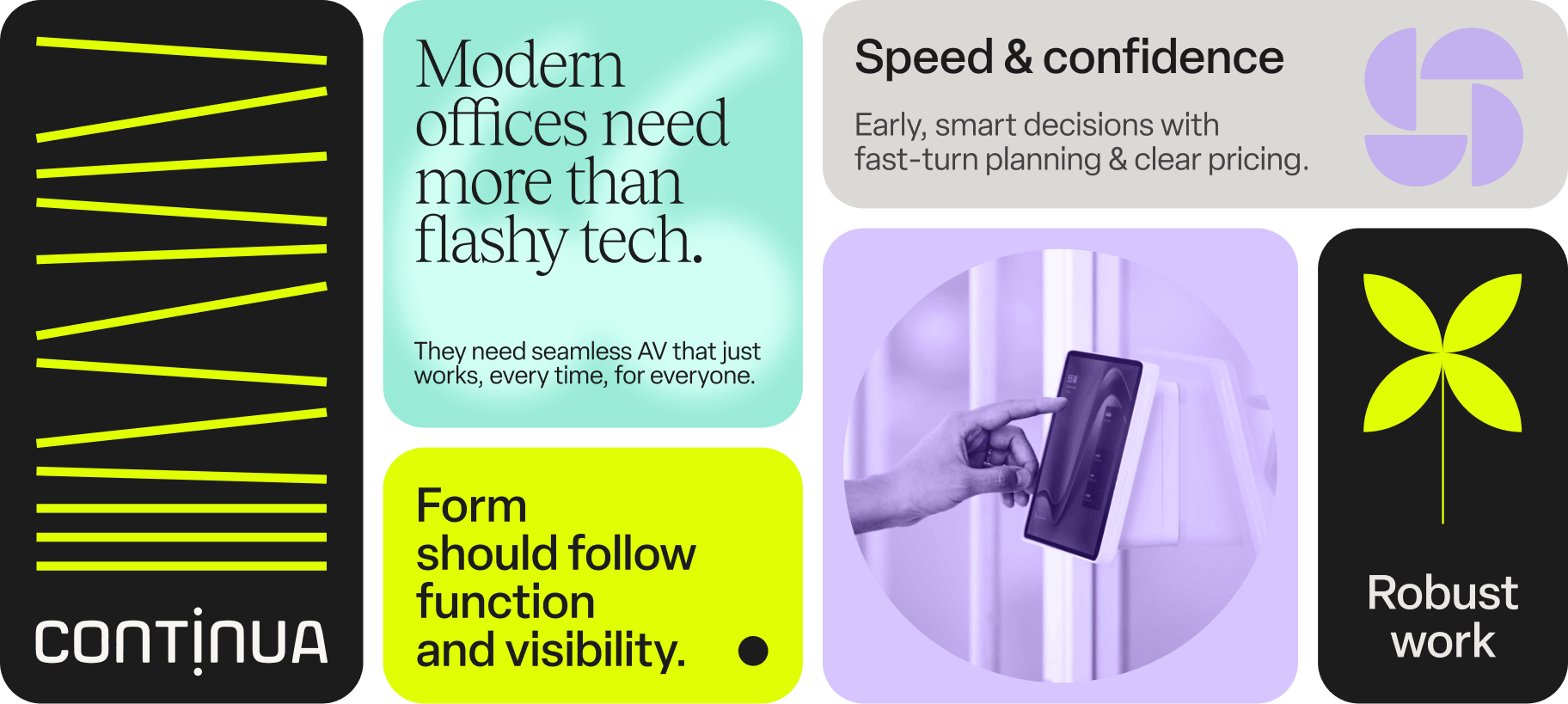
Graphic Devices: Expanding the Visual Vocabulary
I built out a set of graphic devices that could flex across different formats while still feeling distinctly Continua. The system grows from shapes already present in the logo, then extends into circles, lines, blur, geometric forms, and rounded containers.
Digital Brand Hub
I designed and built a dedicated guidelines website that turned the brand system into an accessible, easy-to-navigate resource for the organization. The site brings together the full visual system, usage guidance, and supporting resources in one place, making it easier for teams to find what they need and use the brand consistently.
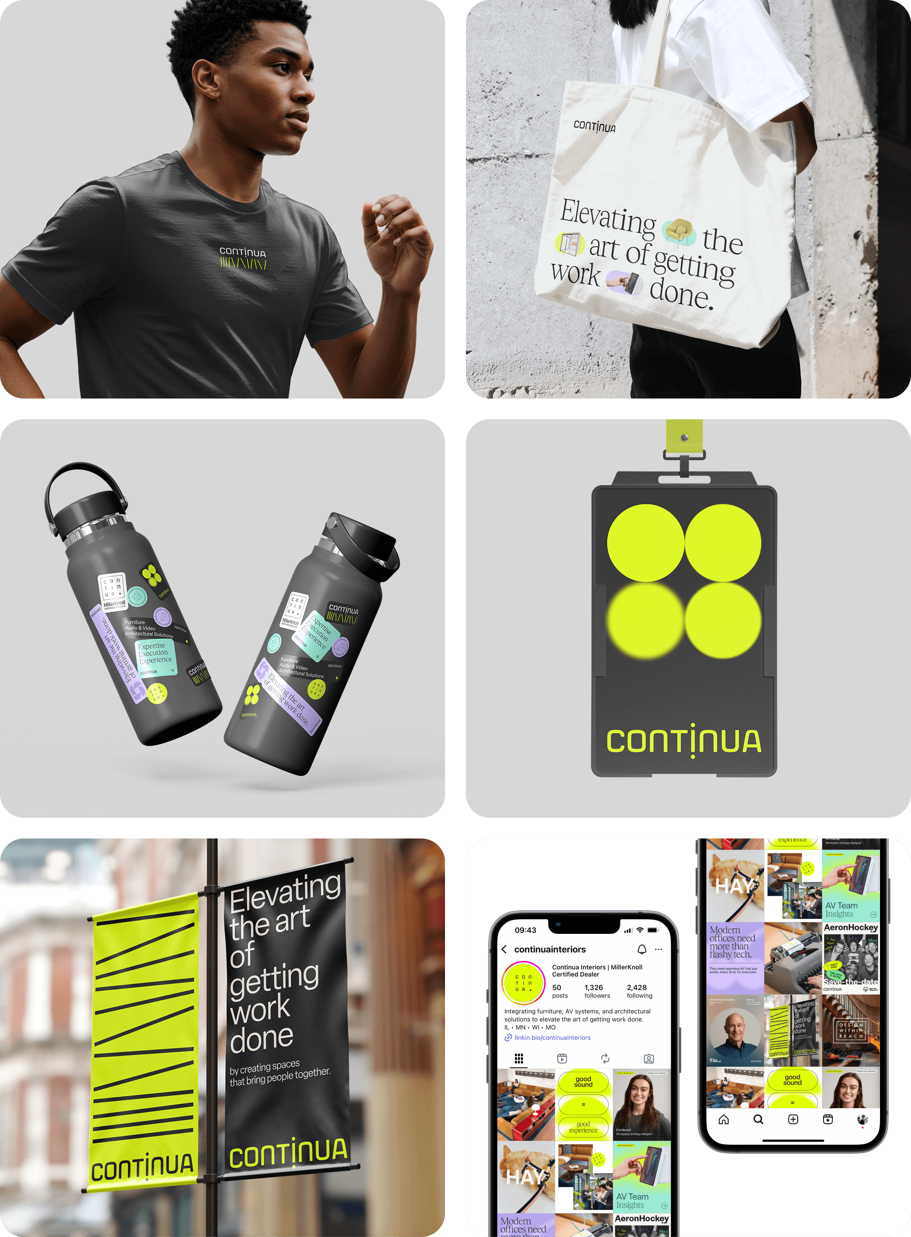
Brand In Use
The refreshed identity was carried into a wide range of applications, including stickers, apparel, tote bags, building passes, koozies, social content, and environmental graphics. Each piece became another way to make the brand feel more recognizable and cohesive.
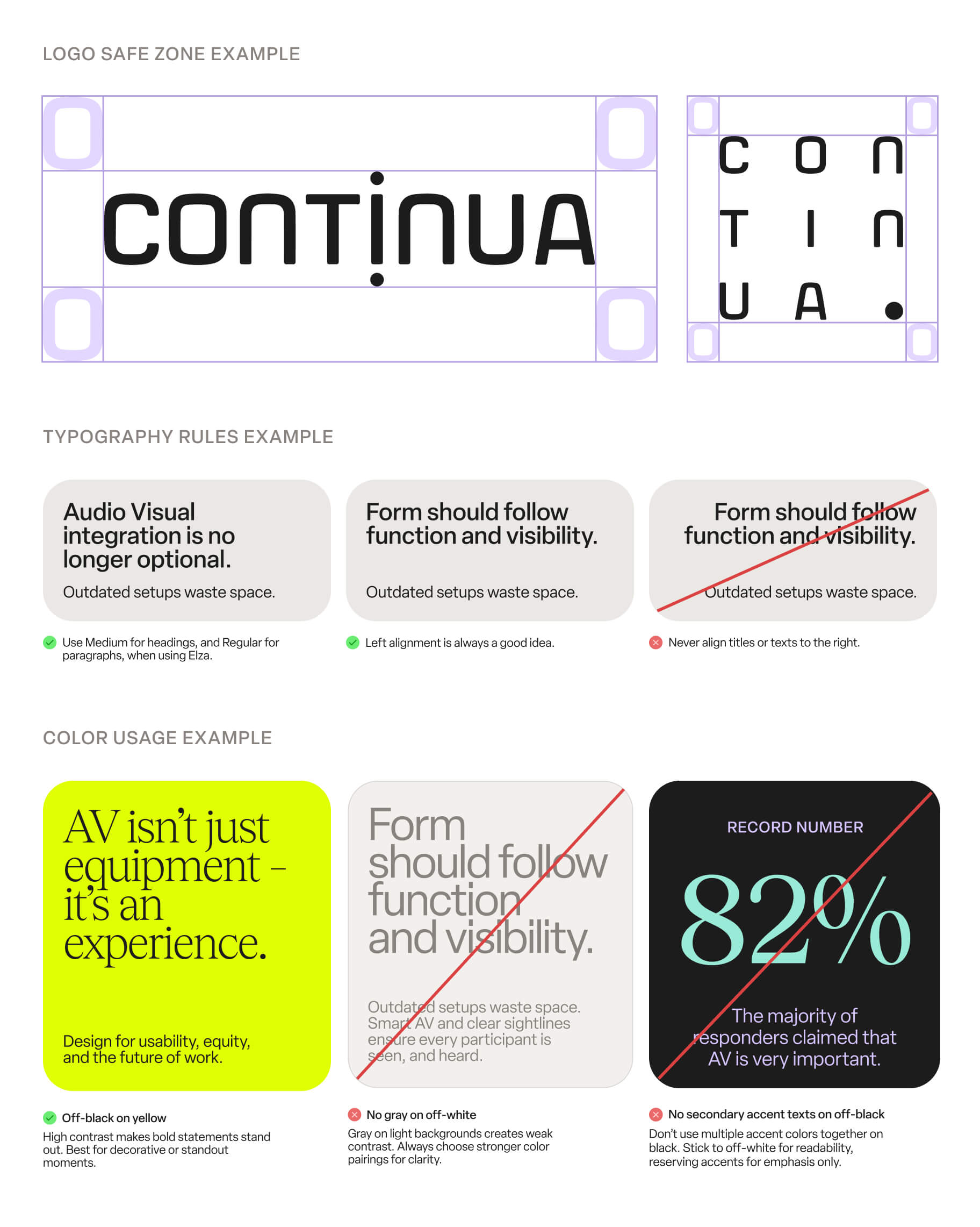
Brand Guidelines: A System People Could Use
I wrote and designed comprehensive guidelines covering logo use, typography, color, grids, graphic devices, and photography. The goal was to make the identity easy to apply across teams and formats, with clear rules and practical examples throughout.