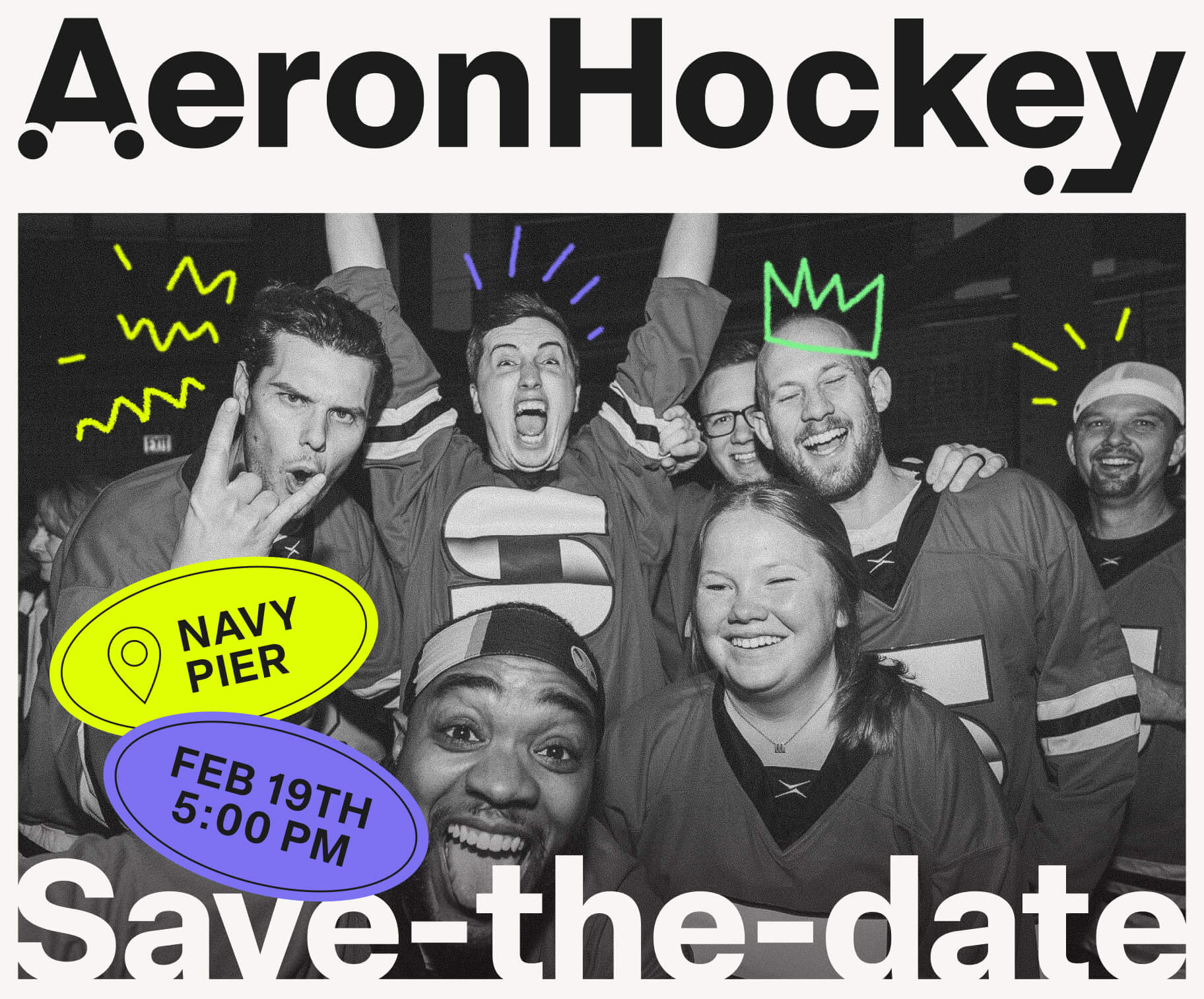
A Fresh Identity for a Beloved Event
Aeron Hockey already had years of history and a loyal following, so the goal was to give the event an identity that matched its energy. I developed a completely new visual direction in time for the 2025 tournament, creating a system that felt playful, competitive, and much more distinctive. The refresh became the foundation for the event itself, from digital promotion and photography to signage and the new website.
A New Logo
I redesigned the Aeron Hockey logo to feel bolder, more energetic, and specific to the event. Small details bring the idea together: chair wheels are built into the A, while the Y incorporates a hockey stick and puck.
I also created vertical and horizontal versions of the logo to accommodate different formats and applications. The system stays flexible across event graphics, merchandise, signage, and digital use.
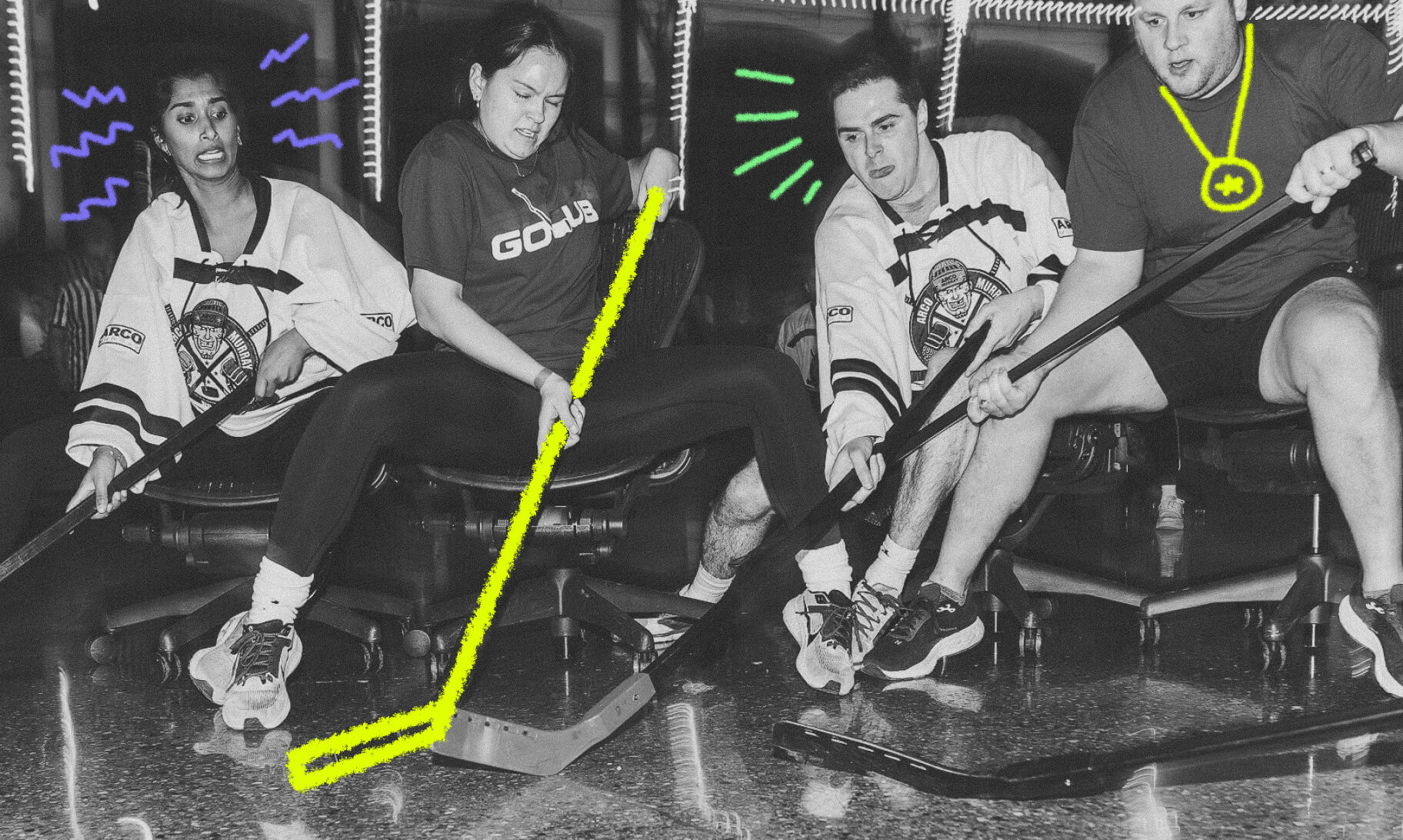
New Colors & Visual Direction
I introduced a new color palette and visual language designed around the speed, humor, and slightly chaotic spirit of the tournament. The image treatment became more expressive as well, giving photography and graphics a stronger point of view across the entire experience.
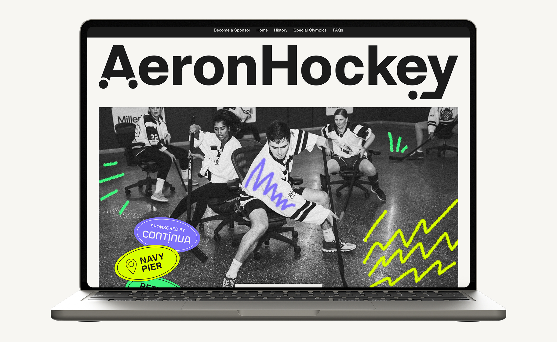
A Brand New Website
I designed and built a new Squarespace website from scratch that introduced the refreshed identity and gave Aeron Hockey a proper home online. The site explains the event, its history, sponsorship opportunities, and its support of Special Olympics Illinois, while carrying the new visual system throughout.
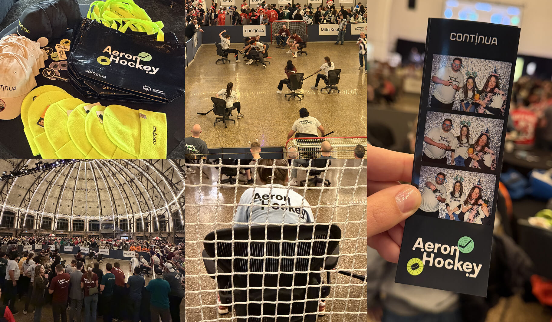
Built for the Real Thing
The refreshed identity came to life at the 2025 tournament in the Navy Pier Ballroom, giving the event a much stronger presence across signage, digital promotion, photography, and on-site materials.
The scale and atmosphere of the venue gave the new visual system room to feel energetic, bold, and cohesive throughout the event. It felt truly rewarding to be there and hear people complimenting the new brand.